


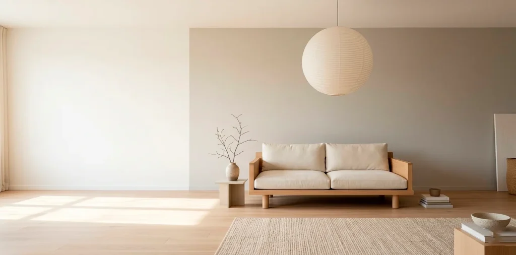

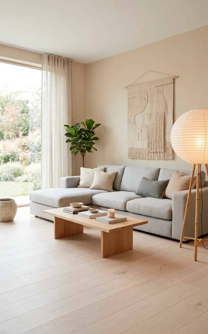
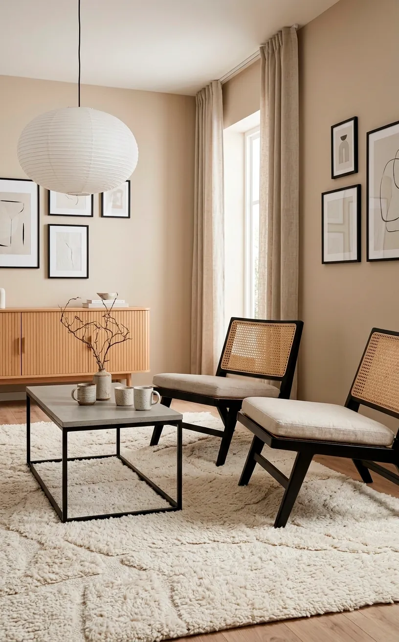
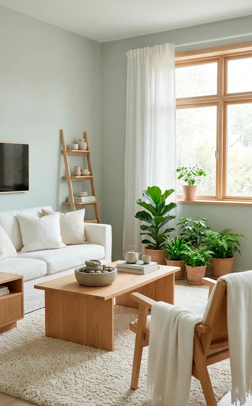
Tired of your living room looking like a sterile hospital ward or a chaotic thrift store? Finding that perfect Japandi balance between Scandi-cool and Japanese-warmth usually starts with your walls. I’ve spent way too many hours staring at swatches to bring you the ultimate list of 20 hues that actually work. Ready to finally fix your home’s vibe?
Benjamin Moore Chantilly Lace
I’m starting with the GOAT of whites. Chantilly Lace is clean, crisp, and lacks those annoying yellow undertones that make walls look like a vintage smoker’s lounge. It provides the ultimate high-contrast backdrop for dark wood accents.
Do you want your space to feel truly airy? This shade reflects light like a dream and makes even tiny apartments feel like sprawling lofts. If you love a fresh start, styling an all-white minimalist room is much easier with this specific base.
Benjamin Moore Swiss Coffee
If Chantilly Lace feels too cold, Swiss Coffee is your new best friend. I love how this creamy white adds instant soul to a room without veering into ‘grandma’s beige’ territory. It feels like a warm hug for your walls. Have you noticed how some whites feel like they’re shouting at you? This one just whispers. It plays incredibly well with natural rattan and light ash wood furniture ☕.
Benjamin Moore Alabaster
Sherwin-Williams fans swear by Alabaster, and honestly, I get the hype. It strikes a perfect balance between cool and warm. I used this in a sun-drenched corner once and the glow was almost spiritual.
Does your room face north? This color prevents that gloomy, blueish cast that often haunts colder spaces.
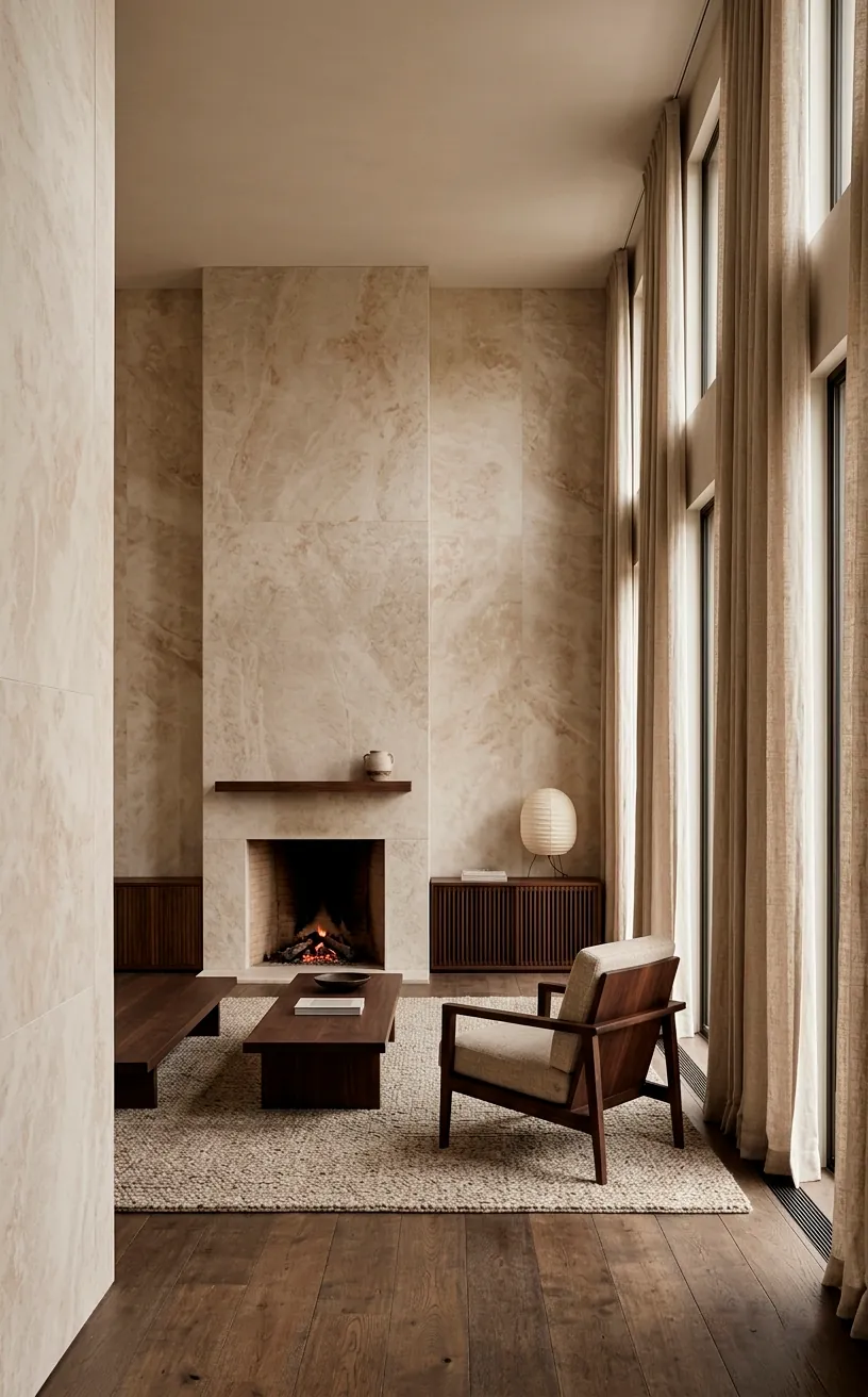
It feels grounded and organic.
You can pair it with stone textures and linen curtains to nail that ‘expensive spa’ look everyone is chasing right now.
Benjamin Moore Pale Oak
Pale Oak is the ultimate ‘chameleon’ color. Depending on your lighting, it shifts between a soft grey and a warm taupe. IMO, it’s the safest bet for anyone terrified of commitment. It never looks muddy or heavy. Why settle for boring grey when you can have this multidimensional masterpiece? I find it looks best when you layer different shades of oatmeal and sand throughout the textiles in the room.
Benjamin Moore Revere Pewter
This is the king of greiges. Revere Pewter brings a bit more depth and ‘weight’ to a Japandi space. I think it works best in larger living rooms where you want to feel tucked in and cozy.
Do you have high ceilings? This color helps bring the scale down to a human level.
It looks stunning against darker oak floors.
I’ve seen people use this on cabinetry too, and the result is always top-tier chic.
Farrow & Ball Shaded White
Farrow & Ball just hits different, doesn’t it? Shaded White is a moody, stony neutral that feels incredibly old-world yet perfectly modern. It has a slight green undertone that connects the interior to the outdoors—a core Japandi principle. It’s not quite grey, not quite beige. It’s just ‘expensive.’ Try it with some unlacquered brass hardware if you want to spice things up just a tiny bit ✨.
Benjamin Moore Edgecomb Gray
Edgecomb Gray is basically a hug in a paint can. It’s lighter than Revere Pewter but carries that same sophisticated DNA. I love using this in rooms with plenty of natural greenery.
Ever wonder why some rooms feel instantly relaxing? It’s usually a color like this.
It stays neutral without being cold.
It acts as the perfect canvas for your favorite ceramics.
Seriously, your pottery collection will pop against this shade.
Sherwin-Williams Accessible Beige
Accessible Beige is exactly what it sounds like: easy. It’s the beige that doesn’t turn yellow or pink when the sun goes down. TBF, finding a beige that behaves is harder than it looks. It works beautifully with black accents, which is a key element in the Japanese side of Japandi. I recommend this if you have a lot of mixed wood tones in your furniture—it ties everything together seamlessly.
Benjamin Moore Manchester Tan
Think of Manchester Tan as refined sand. It has a classic, timeless quality that feels very grounded. I think it looks spectacular with linen upholstery and light-colored rugs.
Are you aiming for a coastal-inspired Japandi look? This is your winner.
It feels breezy and light.
I’ve used this in a bedroom once and it felt like sleeping inside a high-end beach resort.
It’s just that peaceful.
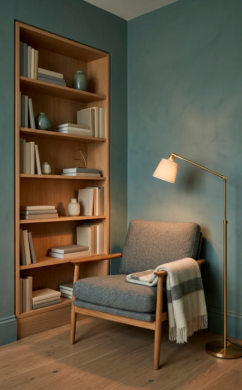
Farrow & Ball Pigeon
Ready for some color? Pigeon is a stunning blue-grey-green that adds a ton of personality while staying firmly in the neutral family. I absolutely adore this for a feature wall or a cozy library nook. It brings that ‘forest floor’ vibe inside. Does your living room need a bit of drama? This is the sophisticated way to do it without being loud. It looks insane when paired with light oak furniture and white paper lamps.
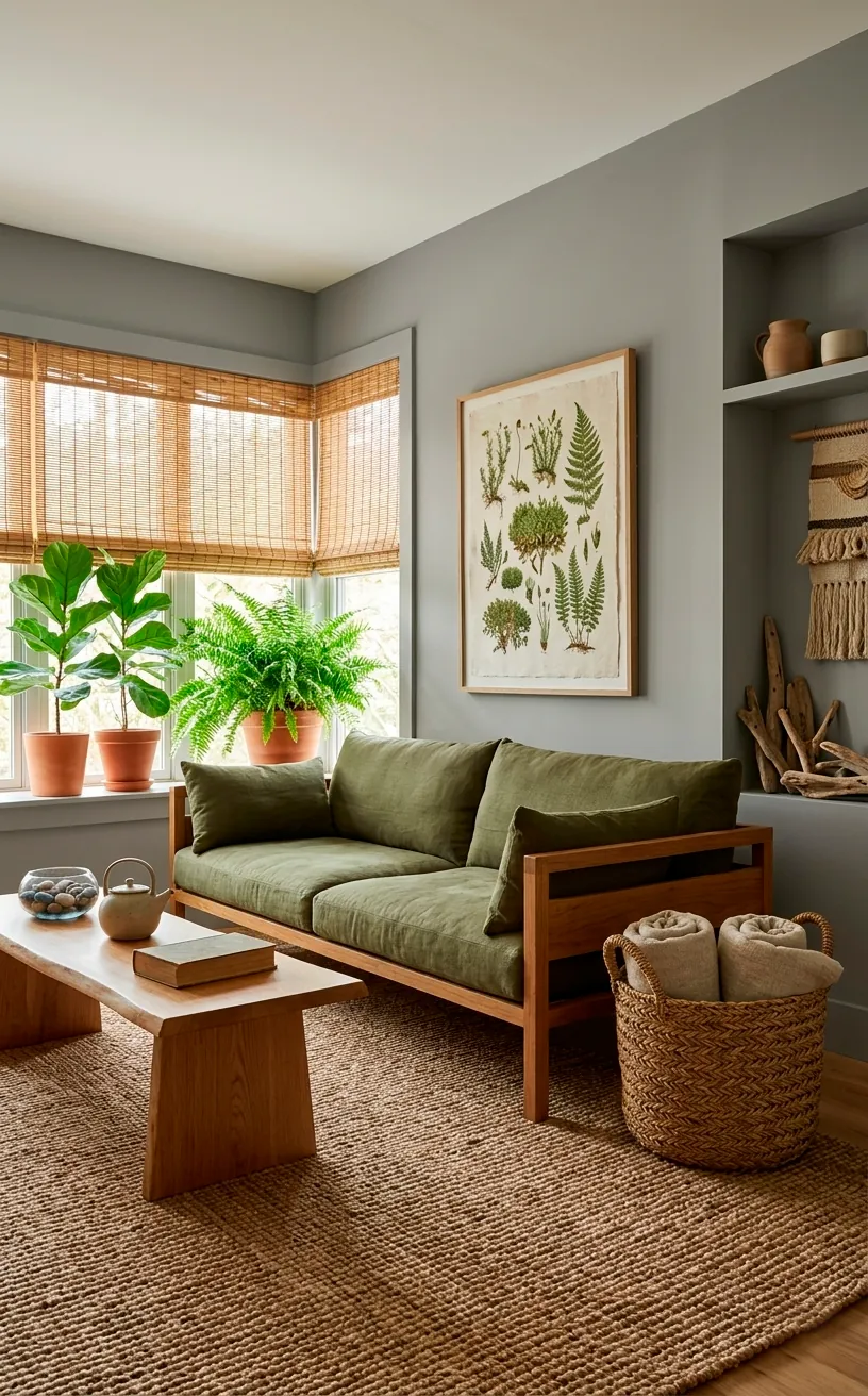
Farrow & Ball French Gray
French Gray is actually more green than grey, and that’s why it works. It mimics the color of sage leaves and looks very organic.
I love how it changes throughout the day. In the morning it’s bright and fresh, but by evening it’s deep and contemplative.
Why go for a flat grey when you can have this life-like shade?
It feels very connected to nature, which is basically the whole point of Japandi.
Pair it with bamboo or hemp textiles for the full effect.
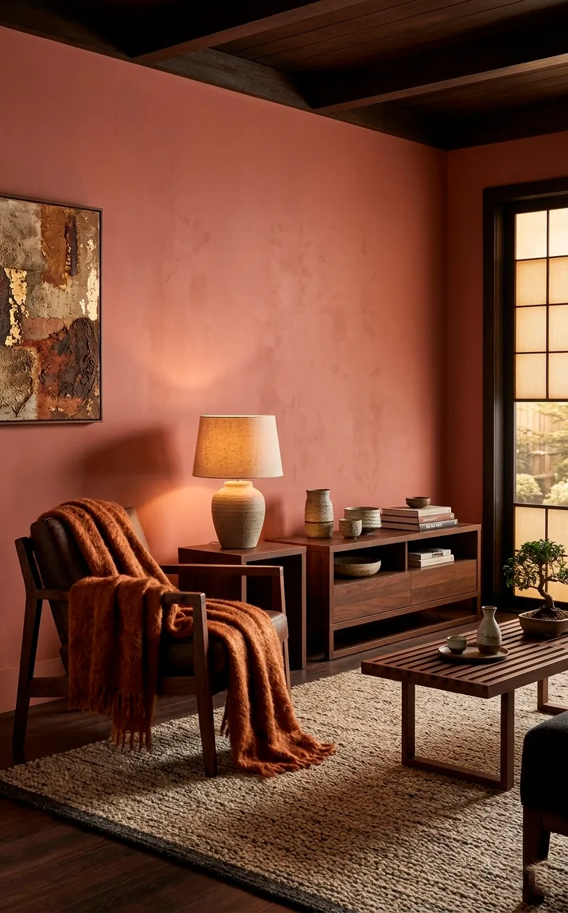
Farrow & Ball Dead Salmon
Ignore the name—I promise your room won’t look like a fish market. Dead Salmon is a gorgeous, earthy pink-brown that feels incredibly grounded. It’s the ultimate ‘warm neutral’ for someone who wants to break away from the beige pack. It feels like aged plaster or sun-dried clay. It’s perfect for creating a cozy, womb-like environment. FYI, this color looks incredible with dark, moody wood tones like walnut or charred cedar 🪵.
Farrow & Ball Setting Plaster
If you want a hint of pink without it looking like a nursery, Setting Plaster is the gold standard. It’s a dusty, flattering pink that makes everyone in the room look like they have a healthy glow.
Who doesn’t want that?
In a Japandi context, it provides a soft contrast to sharp black lines and cool stone floors.
It’s basically the sunset of paint colors.
It feels sophisticated and surprisingly neutral when you pair it with grey or tan accents.
Farrow & Ball Jitney
Jitney is a relaxed, sandy neutral that reminds me of a day at a luxury beach house. It has a bit more warmth than Manchester Tan and feels slightly more ‘sun-baked.’ It’s a great way to bring warmth into a room that has a lot of cool, modern architecture. I think it’s the perfect backdrop for oversized art pieces. Does your wall look a bit naked? Jitney fills the space with warmth even before you hang a single frame.
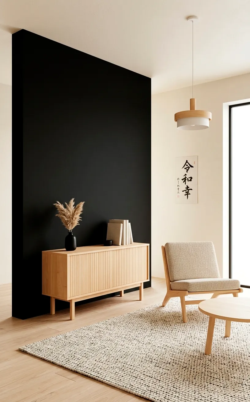
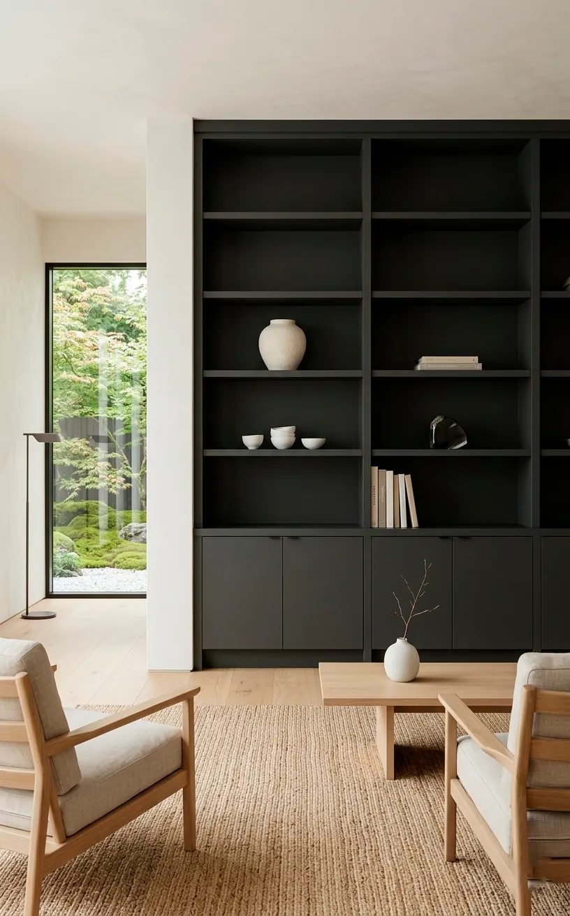
Farrow & Ball Off-Black
Don’t be scared of the dark! Off-Black is a soft, velvety charcoal that provides the necessary ‘anchor’ in a Japandi room.
I usually recommend using this for trim, doors, or a stunning accent wall.
Ever felt like your room was floating away because everything was too light?
This color fixes that instantly.
It adds depth and a sense of ‘wabi-sabi’ mystery.
It looks especially sharp when paired with very light wood like ash or maple for that classic high-contrast look.
Sherwin-Williams Iron Ore
Iron Ore is a deep, rich charcoal that isn’t quite black but has a lot of soul. I love using this on window frames or built-in bookshelves to add a graphic element to the room. It’s less ‘harsh’ than a true black. It feels more like a deep shadow. If you want your living room to feel high-end, adding a touch of Iron Ore is the quickest way to get there. It makes everything around it look more intentional and curated.
Farrow & Ball School House White
This is a wonderful off-white that feels nostalgic and clean. School House White has a softness that modern ‘brilliant’ whites just can’t match.
I think it’s the perfect ‘all-over’ color for a home.
Do you want a cohesive flow from room to room?
This is your workhorse.
It feels timeless.
It looks amazing with traditional Japanese tatami mats or modern woven rugs alike.
It’s a crowd-pleaser that never feels basic.
Farrow & Ball Drop Cloth
Drop Cloth is a mid-toned grey-beige that feels like unbleached linen. It has a rugged, honest quality that I absolutely love for a more ‘rustic’ Japandi look. It doesn’t try too hard. If your house has kids or pets, this is a great practical neutral because it’s very forgiving with smudges. I find it looks best when you embrace the ‘wabi-sabi’ vibe—think wrinkled linen sheets and slightly irregular handmade pottery.
Benjamin Moore Gray Owl
Gray Owl is a cool, crisp grey that feels incredibly modern.
In some lights, it has a tiny hint of green, which keeps it from feeling like cold concrete.
Do you have a lot of light wood furniture?
This color creates a beautiful, refreshing contrast.
It feels very Scandi-forward.
I love using this in rooms with large windows where the cool sky light can really make the color sing.
It’s the ultimate ‘clean girl aesthetic’ for your walls.
Sherwin-Williams Sea Salt
Finally, we have Sea Salt. This is the wildcard of neutrals—it’s a very pale green-grey that feels like a breath of fresh air. It’s perfect for a Japandi room that needs a hint of ‘color’ without losing its calm. I love it in spaces meant for relaxation. Looking for a way to celebrate spring year-round? This is it. To keep it grounded, add some minimalist Japandi decorations and plenty of natural wood elements.
The Final Brushstroke
Picking the right neutral doesn’t have to feel like a math exam. Whether you go for the crispness of Chantilly Lace or the earthy depth of Dead Salmon, remember that Japandi is all about how the space makes you feel. Grab a few samples, paint some swatches, and see how they dance in your light. So, which of these 20 hues is going on your walls first? Let me know in the comments!
Related posts
See AllEarthy Terracotta Sunroom Ideas for a Mediterranean Vibe
Transform your space into a sunny European retreat. Discover simple, earthy terracotta sunroom ideas that bring authentic Mediterranean vibes straight …
Read more15 Playful Memphis Style Attic Loft Ideas with Graphic Shapes
Transform your attic loft with playful Memphis style decor! Discover 15 bold ideas using graphic shapes, vibrant colors, and quirky …
Read more15 Custom Built-In Bed Ideas for a Luxury Kids Room
Ready to transform that chaotic playroom into a high-end sanctuary? Discover 15 jaw-dropping built-in bed ideas that blend luxury, smart …
Read moreA Step-by-Step Guide to Total Laundry Room Organization
Transform your chaotic laundry space into an organized, functional oasis with this step-by-step guide. We share smart storage hacks, sorting …
Read more